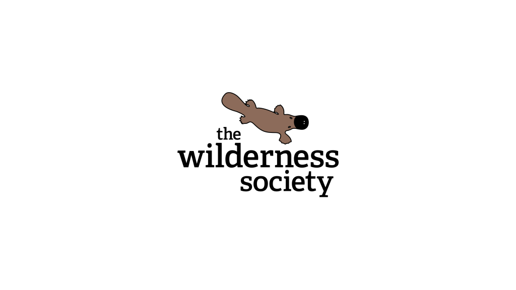
 I heard that a non-profit organisation “The Wilderness Society” was considering a logo rebrand. I used to be a member and so I thought I would have a go at it. Just for fun. Because sometimes us designers do that. I thought the new “W” shaped river logo was too much of a departure from their original logo. So I removed all but the platypus from their old logo. It’s also at a different angle and it’s a different colour. I also changed the typeface to a more modern slab serif.
platypus logo
The Wilderness Society logo rebrand concept idea.
